Maryna Ramcharan addresses the methodological challenges in determining when a place has levelled up.
The Levelling Up White Paper brought together a wide range of policies and programmes happening across government, each with its own monitoring frameworks and outcome/output targets. In the Levelling Up analysis released recently, we use a set of metrics and Sustainable Development Goals which closely match the 12 missions outlined in the White Paper to track the performance of each Local Authority in England since the baseline year of 2015.
In this analysis, we seek to answer the question How do we know when a place has levelled up? This question tasked us with a range of methodological challenges including:
- How to measure levelling up and what metrics to use.
- How to measure the progress of levelling up over the years.
- What target to measure the progress against.
- What would success look like? How do we know when we have levelled up?
This blog looks at how we approached these challenges in the new analysis.
What metrics do we use to measure levelling up?
Our analysis consists of two parts. The first part is a metrics-based analysis where we selected a range of metrics that are a ‘best fit’ measure of the missions outlined in the White Paper, and where data is available for them over time and at a Local Authority geography.
The choice of the geographical breakdown was dictated by the availability of most metrics at the Local Authority level, where most datasets have not been available at lower geographies such as MSOA or LSOA.
It is best from an analysis point of view if the data released is at the finest possible level of spatial disaggregation. In a perfect world, that would be Local Super Output Areas (LSOAs). Lower-level geographies can always be aggregated up to higher-level geographies (e.g., local authority districts to regions) but not vice-versa. However, this has a serious cost barrier and data is often produced at the appropriate level for the policy area (i.e. transport has a different geography to schools and education).
The second part of the analysis is a Sustainable Development Goals (SDG)-based analysis, where we used the international Sustainable Development Goals (SDG) for each Local Authority in England to see how the reduction of spatial inequality aligns with the Sustainable Development strategy outlined by the United Nations. We did not use all 19 SDG goals; only those that were the most aligned with the 12 missions and where data was available for them. This allows us to examine levelling up in a local context, benchmarking to national and international criteria.
What is the ‘level’ in levelling up?
We decided upon 2015 as a baseline year to be The Level to compare with all subsequent years. The choice of the base year was based on data availability and consistency under the assumption that we could observe improvement over time on average. Furthermore, 2015 precedes both the Covid-19 pandemic and Brexit, which were major shocks for the UK economy and proceeds many of the changes to local-level indicators occurring in the early part of the decade.

How do we know if there is progress on levelling up?
To measure the progress on levelling up we chose the 2015 average performance of all Local Authorities in England to be a baseline which all subsequent years will be benchmarked against.
Why did we not use cross-sectional comparisons e.g. comparing a place’s performance against median metric performance at the same point in time? Well, if one were to plot local authorities on a distribution curve based on metric performance or point to the mean, median or mode of metric performance as the benchmark for levelling up, then relatively speaking there will always be authorities that have failed to level up this year, even if their performance improved continuously year on year. The issue with this approach is that all places could improve in real terms but in comparative terms they have the same position against the average, the challenge was to understand what success was. That is why we rejected the idea of cross-sectional comparisons.
Furthermore, we rejected the idea of using year-over-year comparisons (Year-Over-Year or YOY) which could be another possible method. In this case, metric performance at one year would be compared with those of a previous year. However, it was important for us to use a single reference year to account for structural changes in places which may not be obvious in annualised basis comparisons.
For these reasons, we decided to use a single reference year of 2015 as a base year to measure the progress on levelling up and average performance (median) of all Local Authorities in England to be a baseline which all subsequent years will be benchmarked against.
This was the greatest methodological challenge with this research, as there were no targets set by the government on performance, against which to measure progress. There were no benchmarks for when we had levelled up. Therefore, we had to create them, we chose the average baseline of 2015 as a conservative ‘target’ for each indicator. This assumed that aiming for a general improvement for everywhere above a given baseline, set in the past, would lead to positive progress for the Nation.
How do we track the progress of levelling up within time?
To track the progress of levelling up within time, we overlaid the 2015 distribution with the values of the metrics as they were in subsequent years 2016, 2017 and 2018. Furthermore, we used a system of colours to label each data point depending on which Quartile2015 it lands within.
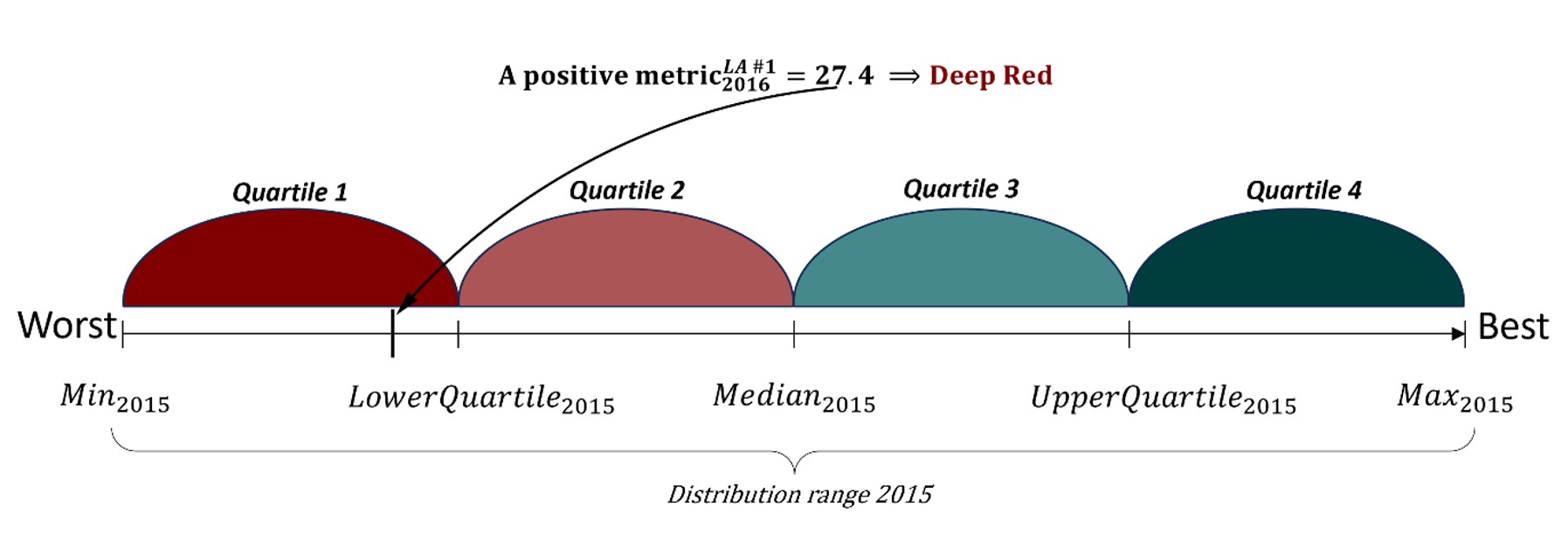
In the picture below (see Figure 1) there is a 2015 distribution which we split in four quartiles by its minimum, lower and upper quartiles, median and maximum values. Quartiles 1 and 2 which are below Median2015 (that is ‘The Level’ in levelling up terms) have been highlighted in shades of red, and Quartiles 3 and 4 which are above the Median2015 have been highlighted in shades of green.
Now if we overlay the 2015 distribution with some 2016 metrics and this metric would fall in Quartile 1, then we assign this metric with a ‘Deep Red’ colour.

Figure 1. 2015 distribution with an overlaid metric. Source: Levelling Up Analysis, City-REDI, 2024
We repeated the same calculations for all metrics, all geographies, and all years of 2015-2018.
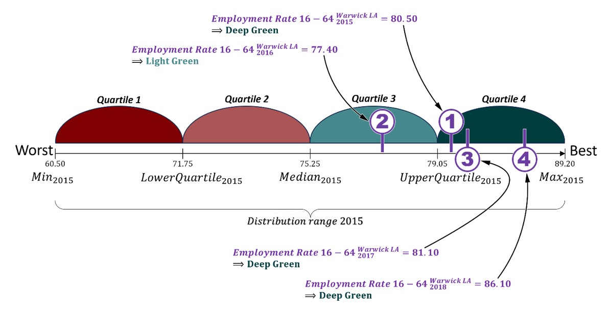
To further demonstrate how we track the progress of levelling up, let’s look at an example. For this, we’ll look at the metric of Employment Rate 16-64 and we will track the progress of this metric in Warwick Local Authority during the year (see Figure 2 below).

Figure 2. 2015 distribution of Employment Rate 16-64 in Local Authorities of England with overlaid Employment Rates 16-64 of Warwick LA for four subsequent years. Source: Levelling Up Analysis, City-REDI, 2024; ONS, Annual Population Survey
Firstly, we calculated the 2015 distribution of Employment Rate 16-64 in England and its key indicators of minimum, lower and upper quartiles, median and maximum values which split the 2015 distribution into four quartiles. As we can see, the 2015 Employment Rate in England ranged from 60.5 (which is its minimum value in 2015) to 89.2 (which is its maximum value in 2015) with the median at 75.25 which is the level in levelling up terms.
Secondly, we computed the Employment Rate in Warwick LA for 2015, 2016, 2017 and 2018 years which were 80.5, 77.4, 81.1 and 86.1 respectively.
Overlaying the 2015 distribution with these values we can track the progress of the Employment Rate in Warwick LA within years compared to the level of 2015. Thus, the Employment Rate in 2015 was 80.5 in Warwick (marked as 1 in the diagram) and it lands in Quartile 1 of the 2015 distribution. In 2016 the Employment Rate in Warwick slightly dropped to 77.4 (2 in the diagram) and travelled from Quartile 4 to Quartile 3 of 2015 Range. Although it somewhat decreased in 2016 it remained above the level of the 2015 Median, meaning that Warwick performed better than the average Local Authority in England in the base year 2015 and stayed consistency above that level. In our methodology for assessing levelling up, it means that Warwick was levelled up with regards to a single metric of Employment Rate.
In 2017 the performance of Warwick LA improved to 81.1 (3 in the diagram) and in the next year 2018 the Employment Rate grew further to 86.1 (4 in the diagram).
What does success look like?
In the above example of Warwick LA and its Employment Rate, we saw that Warwick has levelled up with regards to this one single metric of Employment Rate as for several years, the Employment Rate remained above the level of the 2015 average.
The overall success of levelling up was defined by the fact that a place outperforms the 2015 average across a range of metrics and SDG goals by the final year of measurement. Therefore, we define a place as levelled up when across all metrics and all SDG goals, this geography was at the average level of 2015 or above.

Conclusions
Assessing whether a place has ‘levelled up’ is complex without targets, our methodology is one way to view this methodological issue. It tries to illuminate issues, such as the level being a moving target year on year, the effects of results being on a distribution curve that has as much to do with how your neighbouring Local Authorities perform as how you perform, and the effects that outliers can have on performance.
Our approach was to think about this in terms of what is the minimum acceptable performance we might be happy with on each indicator and are all places improving on that performance? The assumption is that if everywhere is doing better than the average in 2015, then overall, the nation will have improved relative to 2015.
We could have looked at a methodology which narrowed the gap between the highest and lowest-performing places, but this can mean the best is being held back which in overall terms holds the nation back.
In conclusion, we found several methodological and data issues as we developed this approach, including:
- The data is inconsistent over the geographies time and creates gaps which creates ‘white spots’ on our analysis and maps. This is due to changes in administrative geographies. So to understand improvement, we need consistency in data collection units.
- There is a lot of noise in outcome data, including relative performance, external and often unknown influences, and how much action has affected the outcome. Greater analysis and linking to interventions is needed to really understand place performance.
- Lack of clear monitoring and targets for policy missions leads to varying interpretations and methods for understanding performance. Lack of targets also means investment isn’t clear, and it is difficult to understand the performance of government and other agencies in delivering change.
This blog was written by Maryna Ramcharan, Senior Policy and Data Analyst, City-REDI / WMREDI, University of Birmingham.
Disclaimer:
The views expressed in this analysis post are those of the author and not necessarily those of City-REDI / WMREDI or the University of Birmingham.
